That pretty much sums it up...
Saturday, July 17, 2010
Thursday, July 15, 2010
{Fabric Friday} mid-century modern love...
When I think about mid-century modern design, the fabric that comes to mind first is barkcloth. Many of the classic retro fabrics were printed on the nubby cotton fabric that was popular from the '50's-'70's. I have a little collection of barkcloth in my klt:fabric stash. I have used it for pillows, & curtains in our house but have also been know to make a few mid-century klt:plushies as well. I have recently started using solid barkcloth for some thread drawing pillows & mini plush because I love the great texture.
{ fabric photos via Full Swing Fabrics & Tonic Living Fabrics }
These four "retro" prints on barkcloth are some of my current favorites that are being printed today. But of course, you can always find some groovy barkcloth fabrics at some antique malls and thrift stores too. Sometimes the hunt is just as fun as finding it. On one of my last trips to Seattle with Chris, we went to a few of our favorite junk stores on the search for some mid-century treasures. While I didn't find the barkcloth that I was hoping to score, I found a beat up old Eames chair - and boy was that hard to walk away from... Happy Fabric Friday - hope you have a swingin' weekend!
Wednesday, July 14, 2010
{Good Read} Stunning illustrations
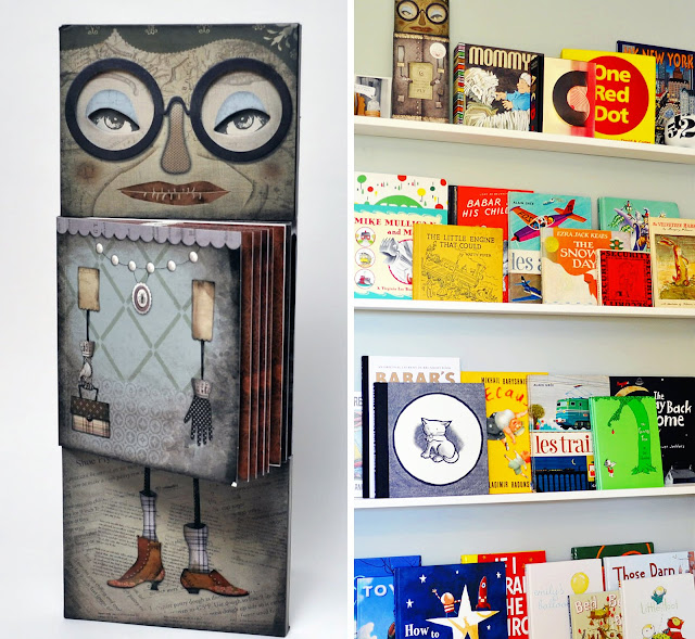
I love books- everything about them. One of my favorite things to do is browse book stores. The book design is what really attracts me to this activity. I have my favorite book designers & illustrators and think of them as having rock star status. Admittedly, I have purchased books solely on their covers. On those rare occasions that the books content is as good as the cover, well then we have a real keeper.
One of my oldest & dearest friends shares this love of design and books with me. She sent Sayer one of the coolest books I had ever seen, for Halloween this last year. It proudly sits on the very top book ledge in Sayer's room and keeps an eye on him. He actually used to call it mommy - because of the glasses (I hope). Jeremy Holmes was the creator & illustrator of the unique masterpiece, There Was an Old Lady, and partnered with Chronicle Books. Recently, I read a great interview with Jeremy in the new UPPERCASE magazine about how the book came to be.
Isn't it interesting that we live in a time where a small video is made to advertise a book? This video is so cool. It definitely gives you the feeling of the book. Jeremy Holmes did an outstanding job on this project. But looking at his portfolio, he is very familiar with doing good work.
Tuesday, July 13, 2010
{Everyday Inspiration} Color...
Really, more trains you ask? Why yes, as a matter of fact, I do have a few more pictures of trains to share. While I certainly have a fondness of b&w photos, I am a colorist at heart and love bright punches of color as well. I see inspiration in everything and I particularly take note of colors and textures around me. Being a designer and a mom of a little boy means those inspirations may more often than not, come from something that has wheels and is in the lines of transportation. During our adventure to the train museum, I was struck by many notable colors, textures and shapes. My favorite was the beautiful lighting in the old train that we rode. The b&w photos I posted on Saturday really showcased the beautiful shadows, but the light created a wonderful mood and color palette. I loved the flags that lined the train's ceiling and flickered shots of color from the sun streaming in the windows. I suppose the rosy cheeks and blue eyes that I was gazing at during our ride may have captured most of my admiration though.
What gorgeous colors I saw on the outside those old trains. The chipped paint, rusty metal, shadows, and juxtaposing colors sparked my interest. Here is a collage of a few details that I particularly liked and photographed for my sketchbook. I thought Sayer would enjoy looking at them too.
This saffron yellow house behind the black steam engine with red trim, was stunning to me. The inside of the train was gorgeous as well - painted with a vintage green paint and had black and red accents. It just happened to be one of Sayer's favorites. While I think he liked the colors, he was more interested in the buttons, knobs, and levers to fiddle with. I think we all left our train adventure on Friday with a feeling of awe and inspiration.
Sunday, July 11, 2010
{Music Monday} Let's Colour...
I thought that sharing this video would be a nice way to start the week. Now where is a can of paint....? Happy Music Monday!
Subscribe to:
Posts (Atom)


