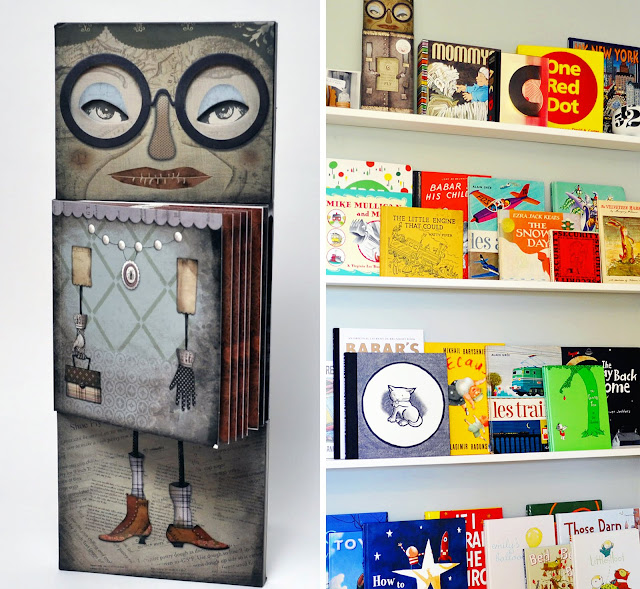
I love books- everything about them. One of my favorite things to do is browse book stores. The book design is what really attracts me to this activity. I have my favorite book designers & illustrators and think of them as having rock star status. Admittedly, I have purchased books solely on their covers. On those rare occasions that the books content is as good as the cover, well then we have a real keeper.
One of my oldest & dearest friends shares this love of design and books with me. She sent Sayer one of the coolest books I had ever seen, for Halloween this last year. It proudly sits on the very top book ledge in Sayer's room and keeps an eye on him. He actually used to call it mommy - because of the glasses (I hope). Jeremy Holmes was the creator & illustrator of the unique masterpiece, There Was an Old Lady, and partnered with Chronicle Books. Recently, I read a great interview with Jeremy in the new UPPERCASE magazine about how the book came to be.
Isn't it interesting that we live in a time where a small video is made to advertise a book? This video is so cool. It definitely gives you the feeling of the book. Jeremy Holmes did an outstanding job on this project. But looking at his portfolio, he is very familiar with doing good work.


I love Sayer's growing library! Wow.. Definitely no princesses or Barbie's there! I love the variety and gorgeous illustrations.. This book however would not be one of K's favourites: it's the eyes. It spooks her out! lol. Love the video to support and market the book too. Awesome!
ReplyDeleteThis book looks so incredibly great! Love the video too!
ReplyDeleteI had to buy 2 copies after looking at that cover! I love children's books!
ReplyDelete